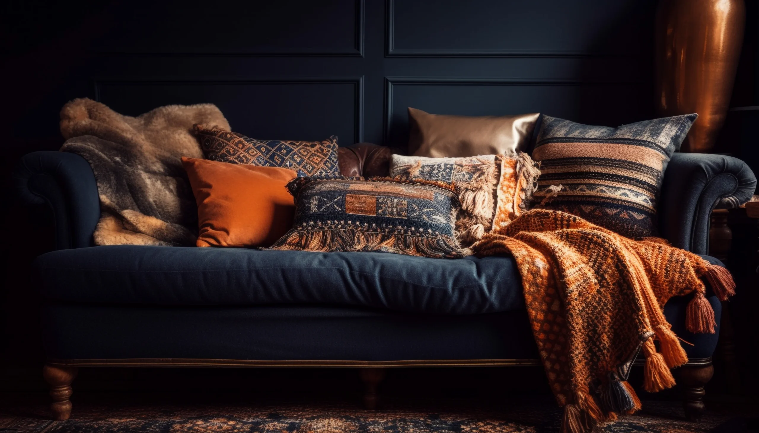
Mixing patterns and textures can make a room feel layered, welcoming, and personal. The goal is not to fill every surface with visual detail. It is to create enough contrast and variety that the space feels interesting while still allowing the eye to rest.
A successful room usually has a clear visual hierarchy: one dominant feature, a few supporting elements, and quieter surfaces that hold everything together. This approach works with almost any interior style, from minimalist and contemporary to traditional, rustic, or eclectic.
Begin With the Room’s Fixed Features
Before choosing cushions, rugs, or wallpaper, identify the elements that are difficult or expensive to replace. These may include:
- Flooring
- Kitchen cabinets
- Countertops
- Built-in storage
- Large sofas or beds
- Fireplace surrounds
- Wall paneling
- Window frames
Notice the colors, grain, finish, and visual weight of these permanent features. A strongly veined stone countertop already functions like a pattern, while exposed brick adds both color variation and rough texture. These surfaces should be included in the design plan rather than treated as neutral background details.
If the room already contains several visually active features, decorative patterns should be used selectively. If its permanent surfaces are plain, textiles and accessories can carry more of the room’s personality.
Establish a Controlled Color Palette
Color is what allows different patterns to feel connected. Choose a small palette before combining prints, materials, and finishes. A practical arrangement includes:
- One dominant color that defines the room
- One or two supporting colors
- A limited number of accent shades
- A neutral that gives the composition breathing room
The colors do not need to match exactly. Slight tonal variation can make a room feel natural rather than overly coordinated. Warm white, cream, and sand, for example, can sit comfortably together even though they are not identical.
Pay attention to undertones as well. A cool gray sofa may feel disconnected from a warm beige rug, even if both pieces are neutral. Repeating either the warm or cool undertone elsewhere in the room can make the combination appear intentional.
Choose One Lead Pattern
A lead pattern provides direction for the rest of the room. It is often the largest, boldest, or most detailed print in the space. It might appear on a rug, upholstered chair, curtain, wallpapered wall, or oversized artwork.
Use the lead pattern to establish the room’s main colors and overall mood. A large botanical print may suggest softer shapes and natural materials, while a structured geometric rug can support cleaner lines and more contemporary finishes.
Once the lead pattern is selected, supporting patterns should complement it instead of competing for attention. They can repeat one of its colors, echo its shapes, or provide contrast through a simpler design.
Mix Patterns at Different Scales
Patterns are easier to combine when their scales are clearly different. Using several prints of similar size can make a room look restless because each one demands the same level of attention.
A balanced combination might include:
- One large-scale floral, botanical, or abstract pattern
- One medium-scale stripe, check, or geometric design
- One small-scale print or subtle woven motif
- One or more solid-colored surfaces
Large patterns tend to command attention from across the room. Medium patterns support the main design, while small patterns add detail when viewed more closely. Solid areas separate these layers and prevent the composition from becoming visually crowded.
This principle also applies to repeated shapes. Wide stripes can work beside a small check because they operate at different scales. Two narrow striped patterns placed together, however, may look unnecessarily busy.
Combine Organic and Geometric Designs
Patterns do not have to belong to the same family. In fact, contrasting pattern types often create a more sophisticated result.
Organic patterns include florals, leaves, flowing lines, animal-inspired markings, and irregular abstract shapes. Geometric patterns include stripes, checks, grids, diamonds, and repeated angular forms.
Pairing an organic pattern with a geometric one creates contrast while avoiding direct competition. For example, floral curtains can sit comfortably beside a striped chair when both share a common color. A curved abstract rug can soften the appearance of square furniture and grid-style wall paneling.
The connection should be subtle. Repeating a color, line direction, or shape is usually enough to make different patterns feel related.
Use Texture to Create Depth
Texture influences both how a room feels and how it reflects light. Smooth, polished materials tend to appear cleaner and more formal, while coarse or soft surfaces often feel warmer and more relaxed.
Useful texture combinations include:
- Linen with smooth leather
- Velvet with natural wood
- Wool with polished metal
- Rattan with painted cabinetry
- Rough stone with clear glass
- Matte ceramics with glossy tile
- Bouclé with dark-stained timber
Contrast is more effective than repetition. A leather sofa becomes more inviting with a wool throw, while a sleek dining table gains warmth from woven chairs or a textured centerpiece.
Texture is particularly important in neutral rooms. When the color palette is restrained, differences in weave, grain, sheen, and softness prevent the space from feeling flat.
Balance Visual Weight
Not every pattern or material carries the same visual weight. Dark colors, bold prints, strong contrast, glossy surfaces, and dense textures generally attract more attention than pale, plain, or matte finishes.
Distribute visually heavy elements around the room instead of placing all of them in one area. If one side contains a dark patterned sofa, the opposite side may need substantial curtains, artwork, or a textured cabinet to restore balance.
This does not require perfect symmetry. The objective is to prevent the room from feeling as though it is leaning visually toward one wall or corner.
Large empty areas are also part of the composition. A plain wall, solid sofa, or uncluttered floor can provide necessary relief between stronger design features.
Repeat Elements Without Matching Everything
Repetition creates continuity, but exact matching can make a room feel overly arranged. Instead of buying a coordinated set, repeat selected details in varied forms.
You might carry a rust color from a rug into a small artwork, a ceramic vase, and one cushion. A curved pattern in the curtains could be echoed by an arched mirror or a round side table. A black metal lamp might connect visually with dark window frames or furniture legs.
Two or three appearances of a color, material, or shape are often enough to establish a relationship. The repeated detail should be noticeable across the room without looking like a themed collection.
Consider Material Performance
A fabric or finish must suit the way the room is used. Appearance alone is not enough, particularly in busy households.
For high-use areas, consider:
- Tightly woven upholstery that resists snagging
- Washable or removable cushion covers
- Rugs suitable for the room’s traffic level
- Moisture-resistant finishes in bathrooms and kitchens
- Fade-resistant textiles near strong sunlight
- Easy-to-clean surfaces in dining and family areas
Delicate fabrics can still be used, but they are better placed where they will experience less wear. A fine embroidered textile may work as framed art or a decorative cushion rather than everyday seating.
Practical material choices help a layered interior retain its appearance instead of becoming difficult to maintain.
Plan Patterns Around Architectural Changes
When a room is being remodeled, flooring, wall finishes, cabinetry, and built-in features should be considered before decorative textiles are selected. These permanent choices establish the visual foundation of the space.
Well-planned Renovation Tips can help homeowners consider how finishes, proportions, and architectural details will interact before work begins. A strongly patterned floor, for instance, may require quieter upholstery, while simple wood flooring can support a more expressive rug.
Collect physical samples whenever possible and view them together in the actual room. Paint, tile, timber, fabric, and wallpaper can look different under household lighting than they do online or in a showroom.
Layer the Room in Stages
A room is easier to edit when its design is built gradually. Begin with the largest surfaces and move toward smaller details:
- Review flooring, walls, and architectural features.
- Position the main furniture.
- Add the lead pattern through a rug, curtain, or upholstered piece.
- Introduce one or two supporting patterns.
- Add contrasting textures through throws, lighting, and accessories.
- Step back and remove anything that competes with the focal point.
Photographing the room can also help. A photo reduces the scene to a flat composition, making crowded areas, uneven color distribution, and competing patterns easier to identify.
Treat Walls and Ceilings as Part of the Design
Patterns and textures are not limited to furniture. Walls and ceilings can provide character through wallpaper, limewash-style finishes, timber panels, decorative molding, exposed materials, or carefully chosen paint effects.
If a wall has a bold treatment, nearby upholstery and artwork should usually be quieter. A subtle textured wall can support stronger furnishings, while a detailed wallpaper may work best as the room’s lead pattern.
Ceiling treatments should relate to the room’s height and existing architecture. Beams, paneling, or a contrasting ceiling color can add dimension, but overly complicated treatments may make a small or low-ceilinged room feel enclosed.
Work With Light and Sheen
Natural and artificial light can change the appearance of both color and texture. Velvet may look rich in soft light but show strong directional shading in brighter conditions. Glossy tile reflects light and surrounding colors, while matte stone absorbs it and appears visually heavier.
Review materials at different times of day before making permanent decisions. Also consider how lamps, pendants, and wall lights create highlights and shadows across textured surfaces.
A room containing many reflective finishes can feel harsh, especially under bright lighting. Combining them with matte paint, natural fibers, or soft textiles creates a more comfortable balance.
Adapt the Mix to the Room
The appropriate level of pattern depends partly on how the space is used.
In a bedroom, quieter patterns and soft textures can create a restful atmosphere. In a living room, a more varied mix may encourage warmth and conversation. Dining rooms and powder rooms can often carry stronger patterns because they are used for shorter periods. Workspaces usually benefit from controlled visual interest that does not distract from the task area.
Open-plan interiors need additional coordination. Patterns do not have to match across every zone, but repeating a color or material can make the connected areas feel cohesive.
Common Mistakes to Avoid
Several issues can weaken an otherwise thoughtful design:
- Using too many bold patterns without a clear focal point
- Selecting every pattern at the same scale
- Ignoring flooring, stone, or wood grain as existing patterns
- Matching every fabric and accessory too precisely
- Mixing undertones without repeating them elsewhere
- Filling every surface and leaving no visual rest
- Choosing delicate materials for demanding locations
- Judging colors and finishes under only one type of light
- Buying all decorative pieces before testing them together
When a room feels too busy, removing one pattern is often more effective than adding another element to connect everything.
Final Thoughts
Mixing patterns and textures successfully depends on hierarchy, contrast, repetition, and restraint. Start with the room’s permanent features, establish a controlled color palette, and select one lead pattern. Add supporting prints at different scales, then introduce tactile variety through materials with contrasting finishes.
The most polished interiors rarely rely on perfect matching. They use repeated colors, related shapes, varied surfaces, and carefully placed quiet areas to create a sense of connection. By building the room gradually and considering both appearance and everyday performance, you can create a layered interior that feels distinctive, comfortable, and deliberately composed.